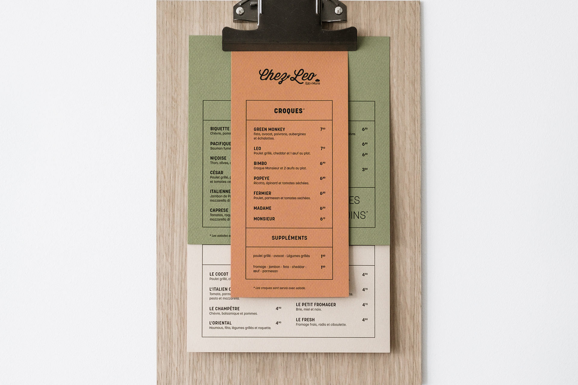
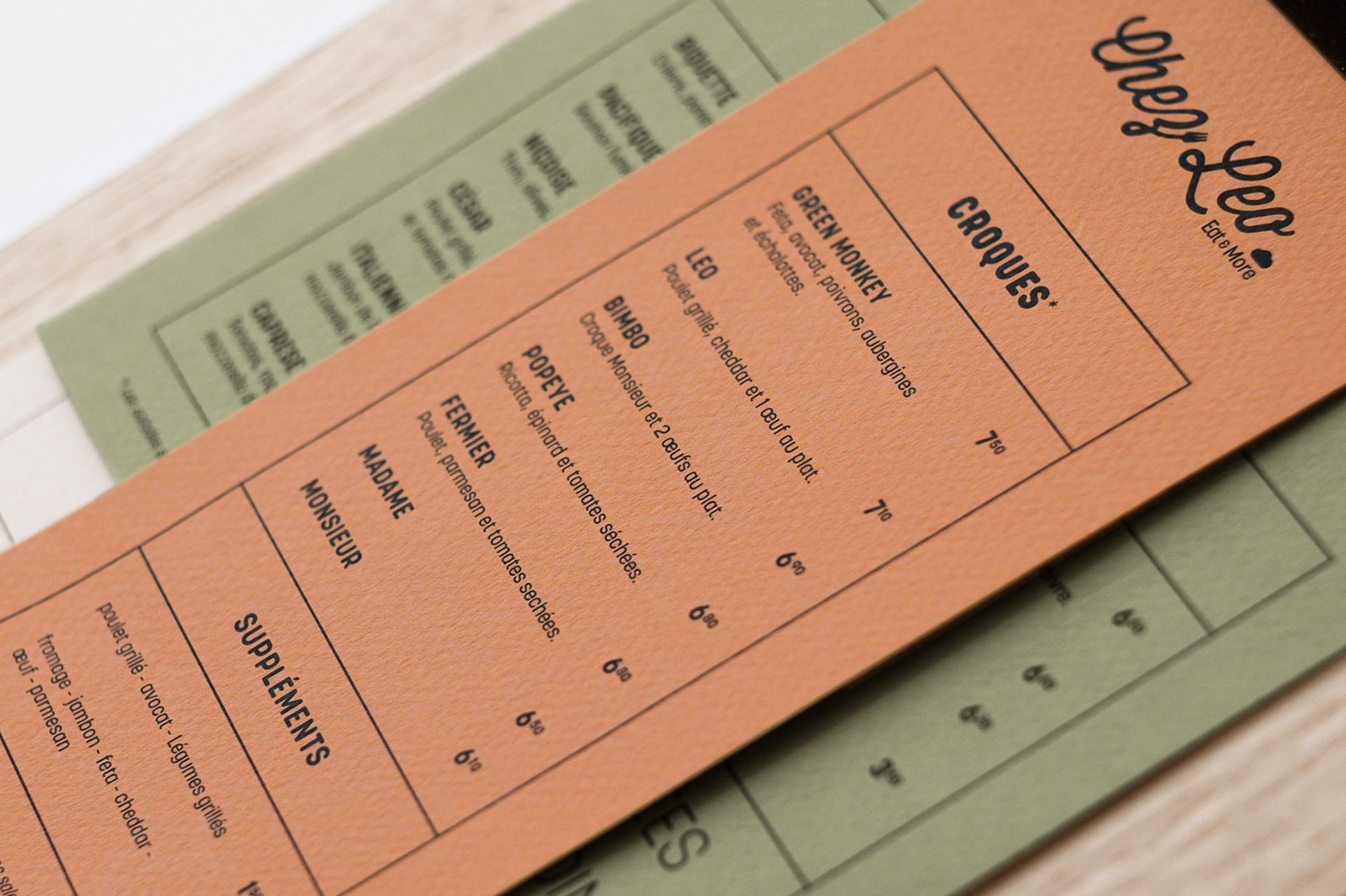
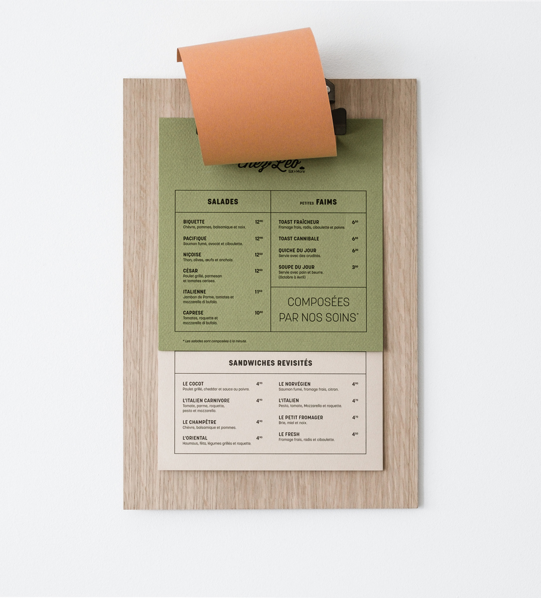
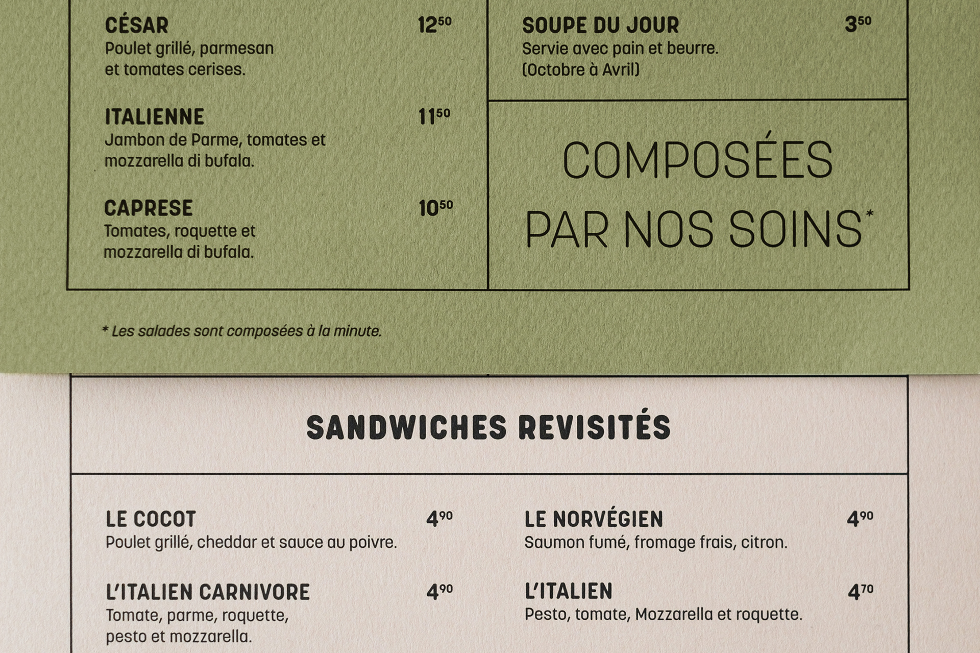
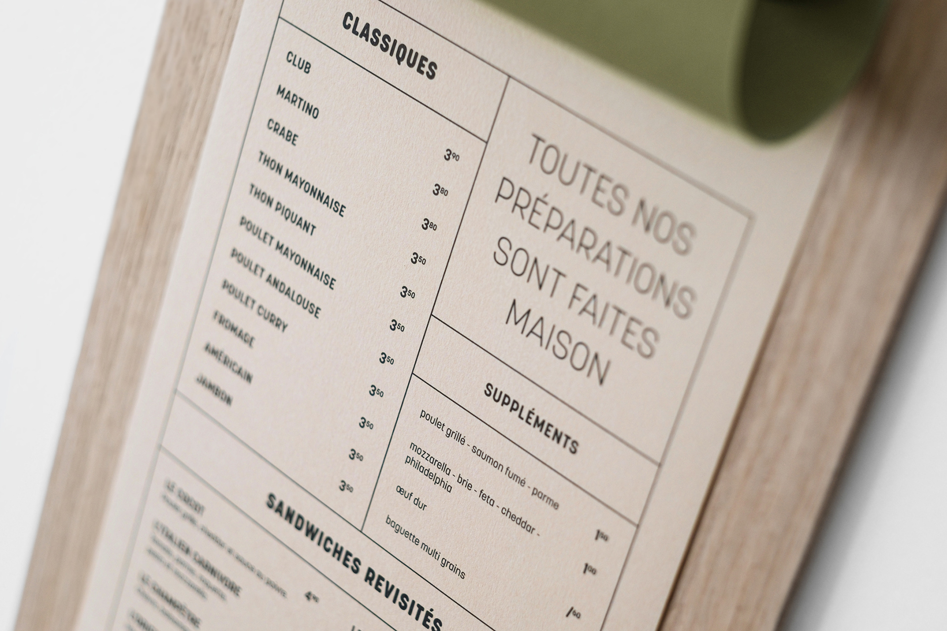
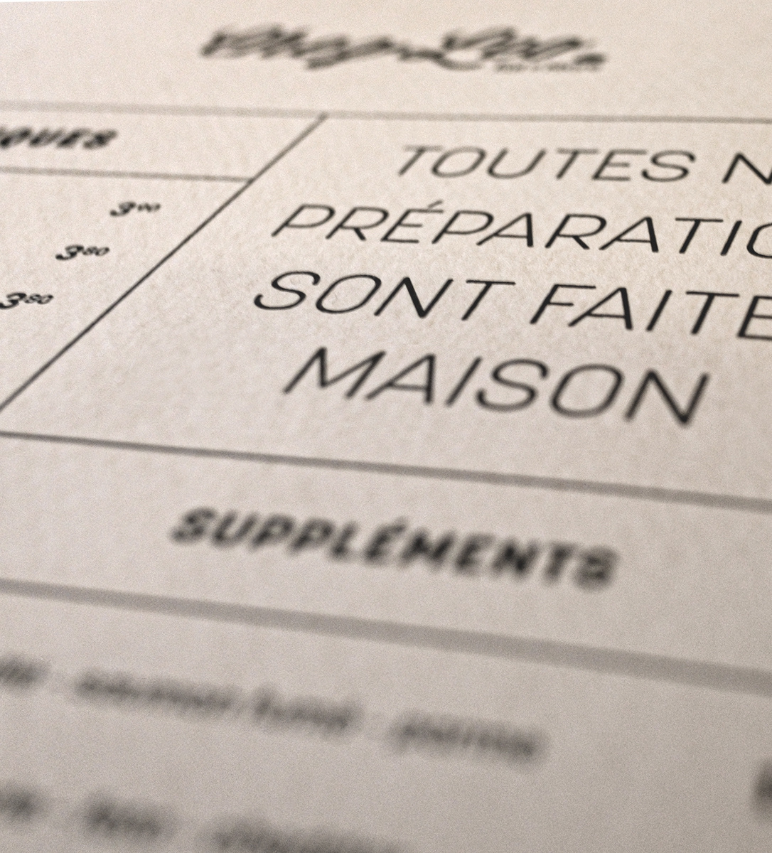
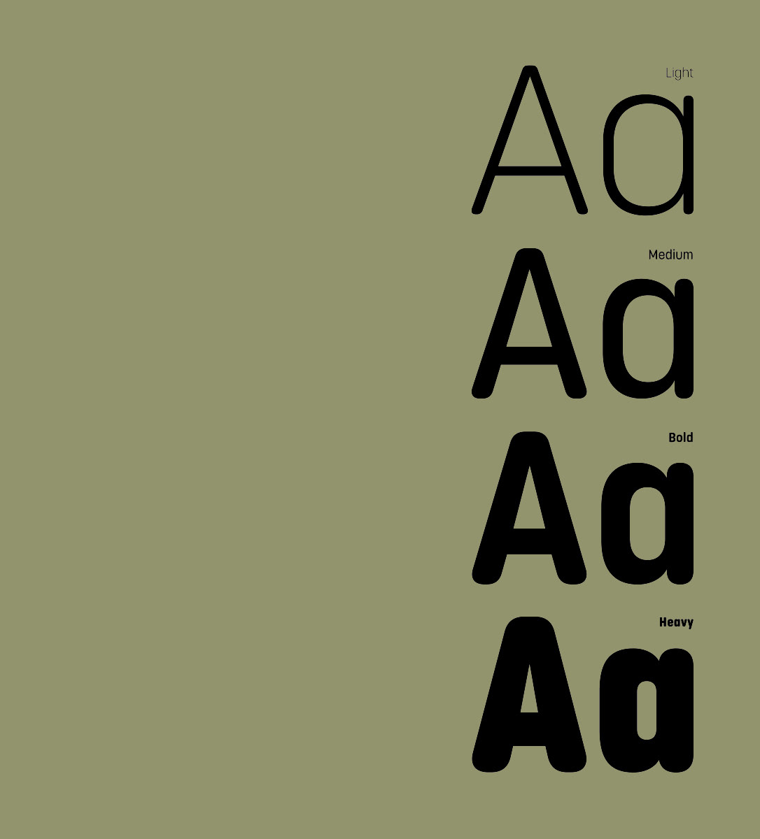
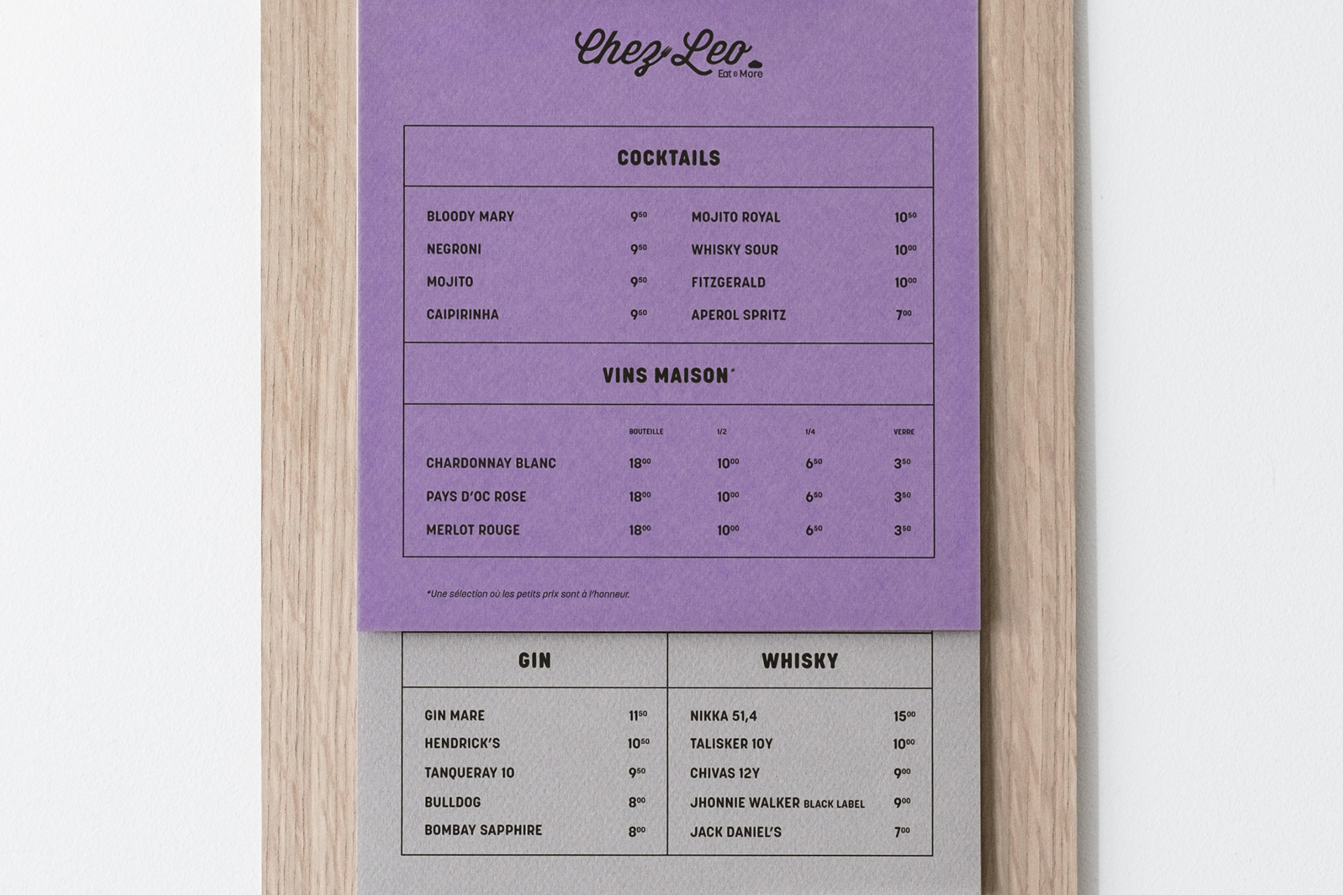
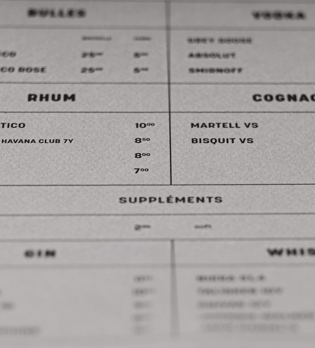
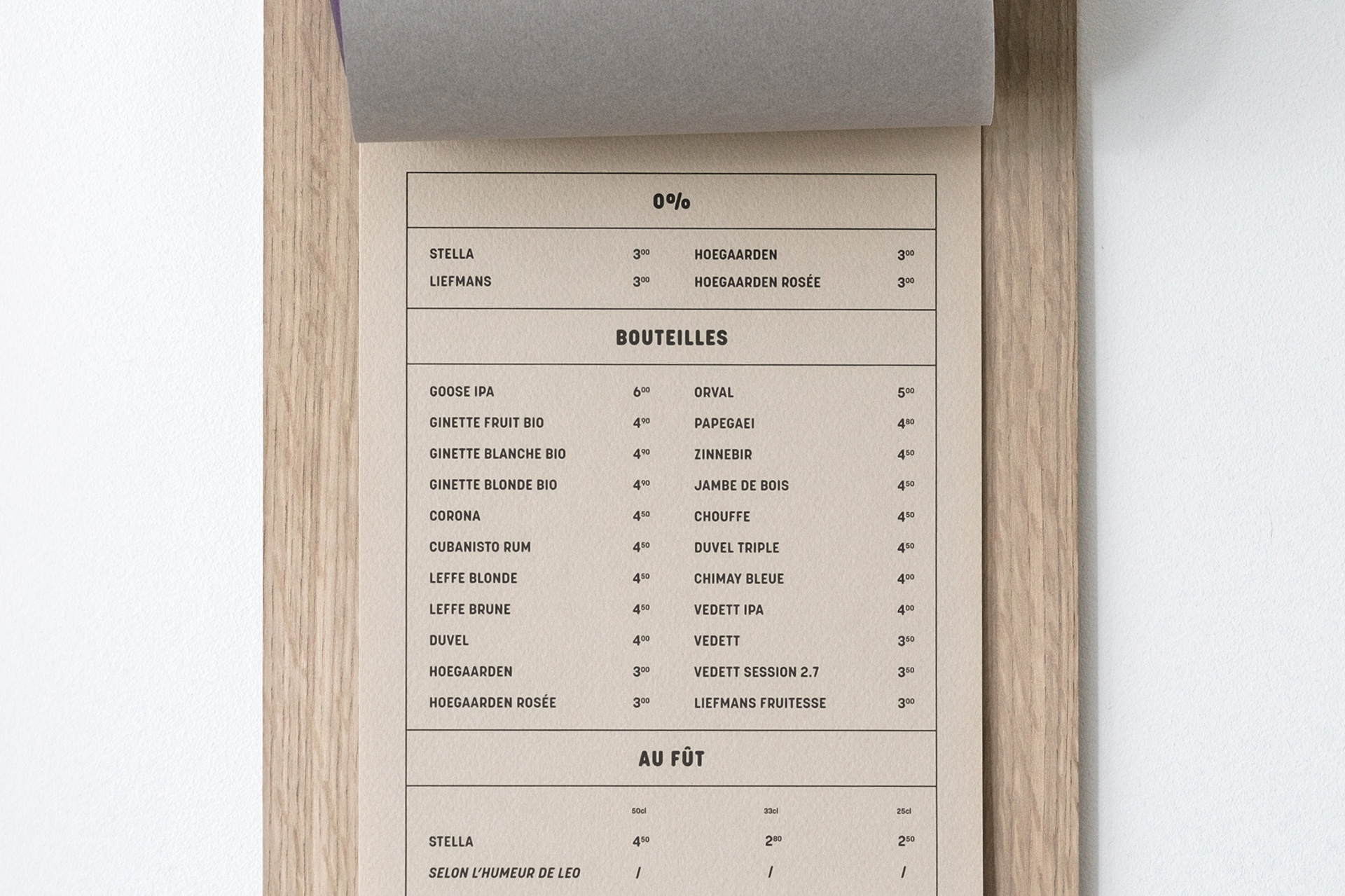
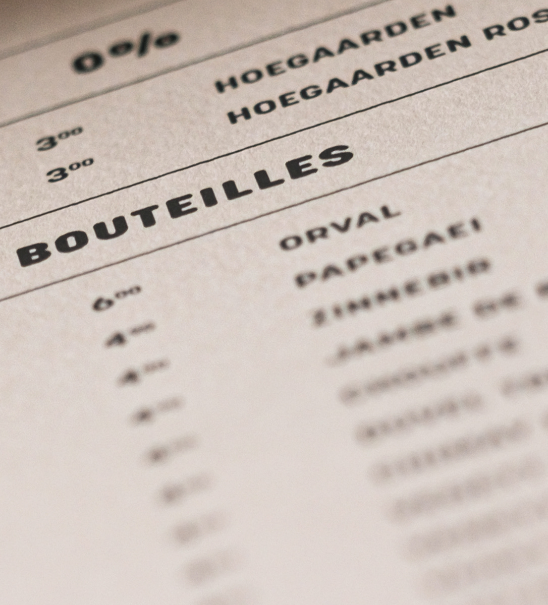
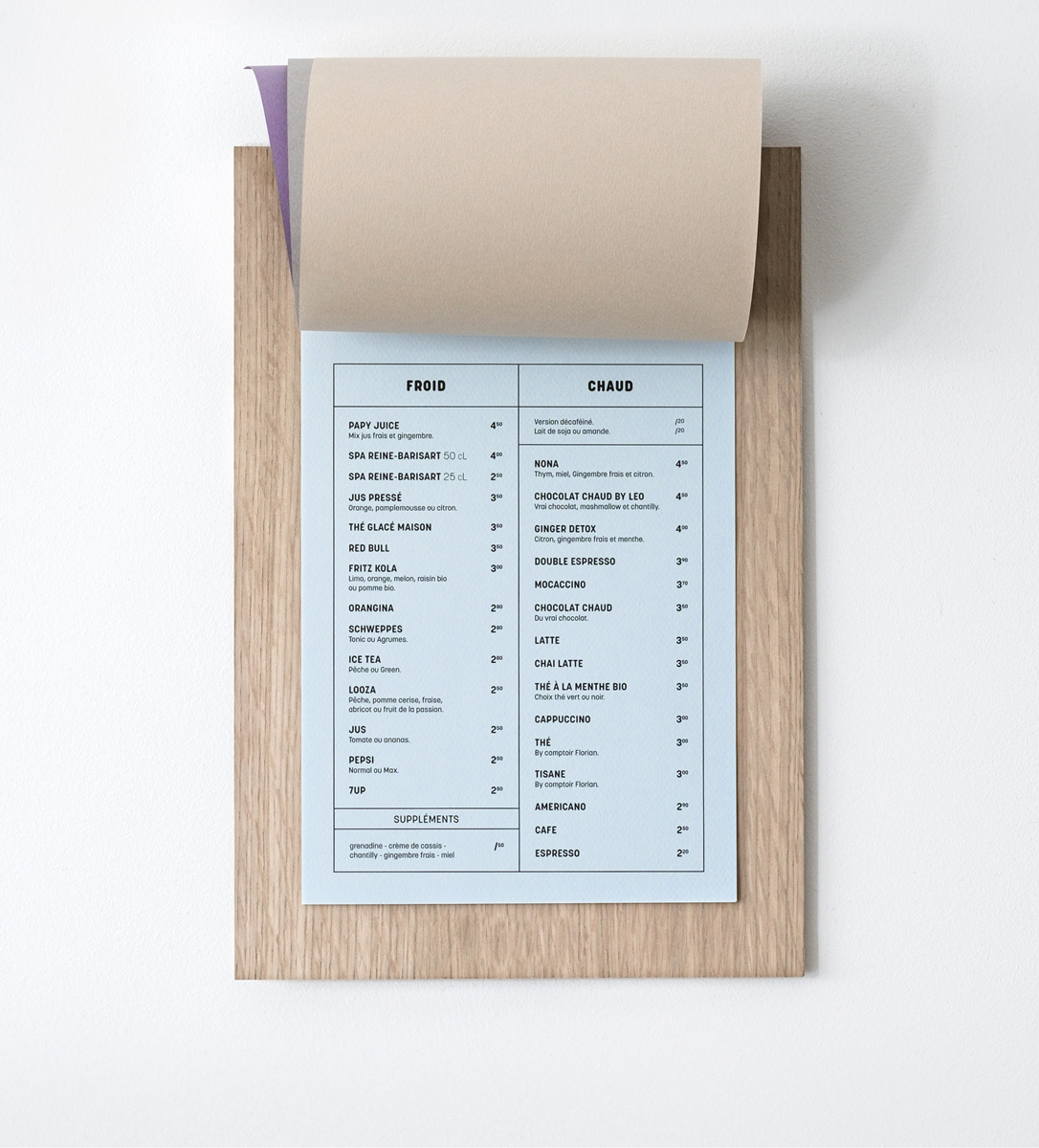
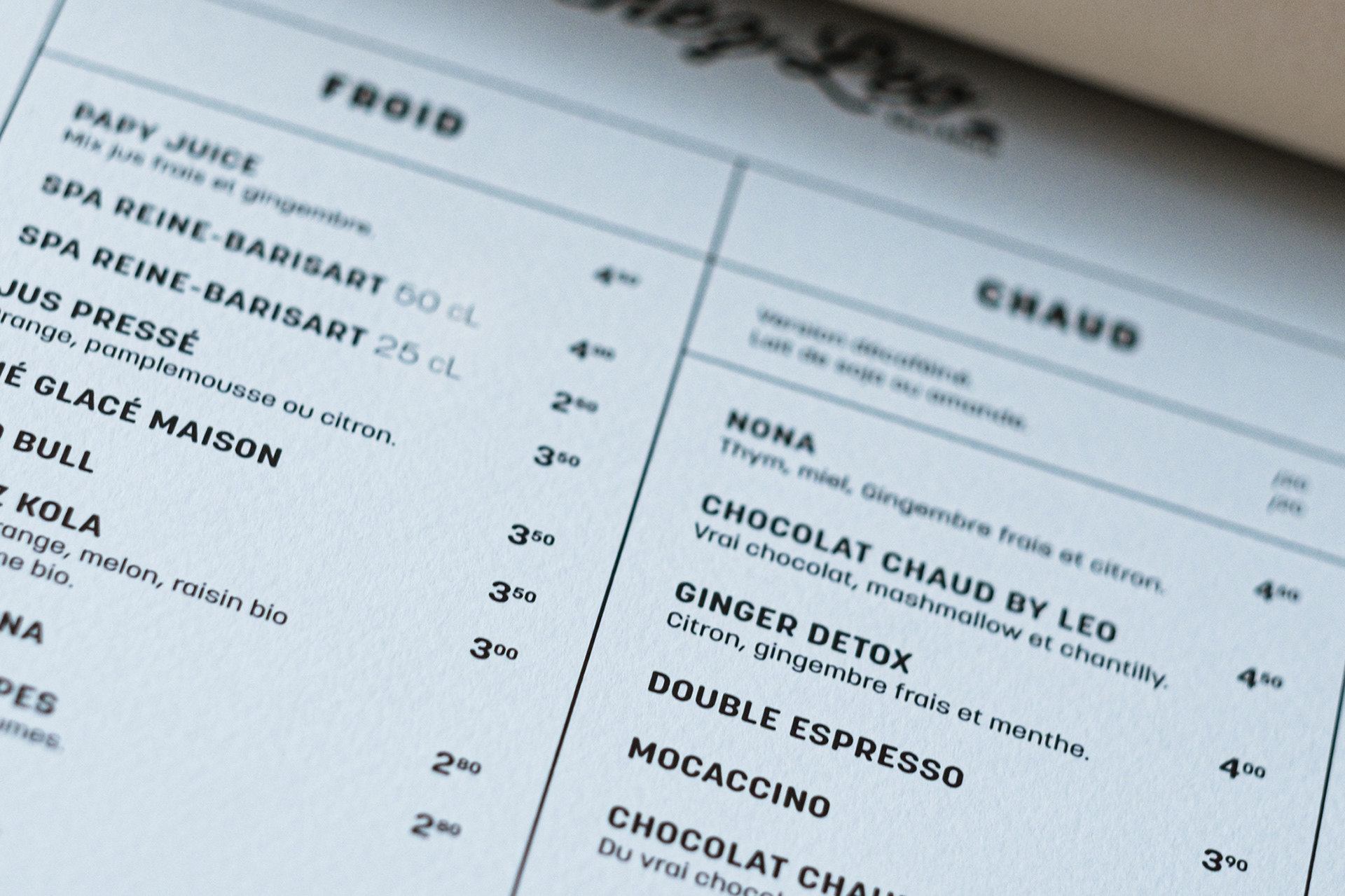
For the design of the ‘Chez Leo’ menu, the approach was centered around a rigorous and structured typographic layout, highlighting each element with clarity and elegance. The menu was printed on Canson Mi-Teintes 180g paper, to enhance the tactile experience. The choice of colors for each category further strengthens this identity, avoids monotony and ensures a smooth, intuitive reading experience.
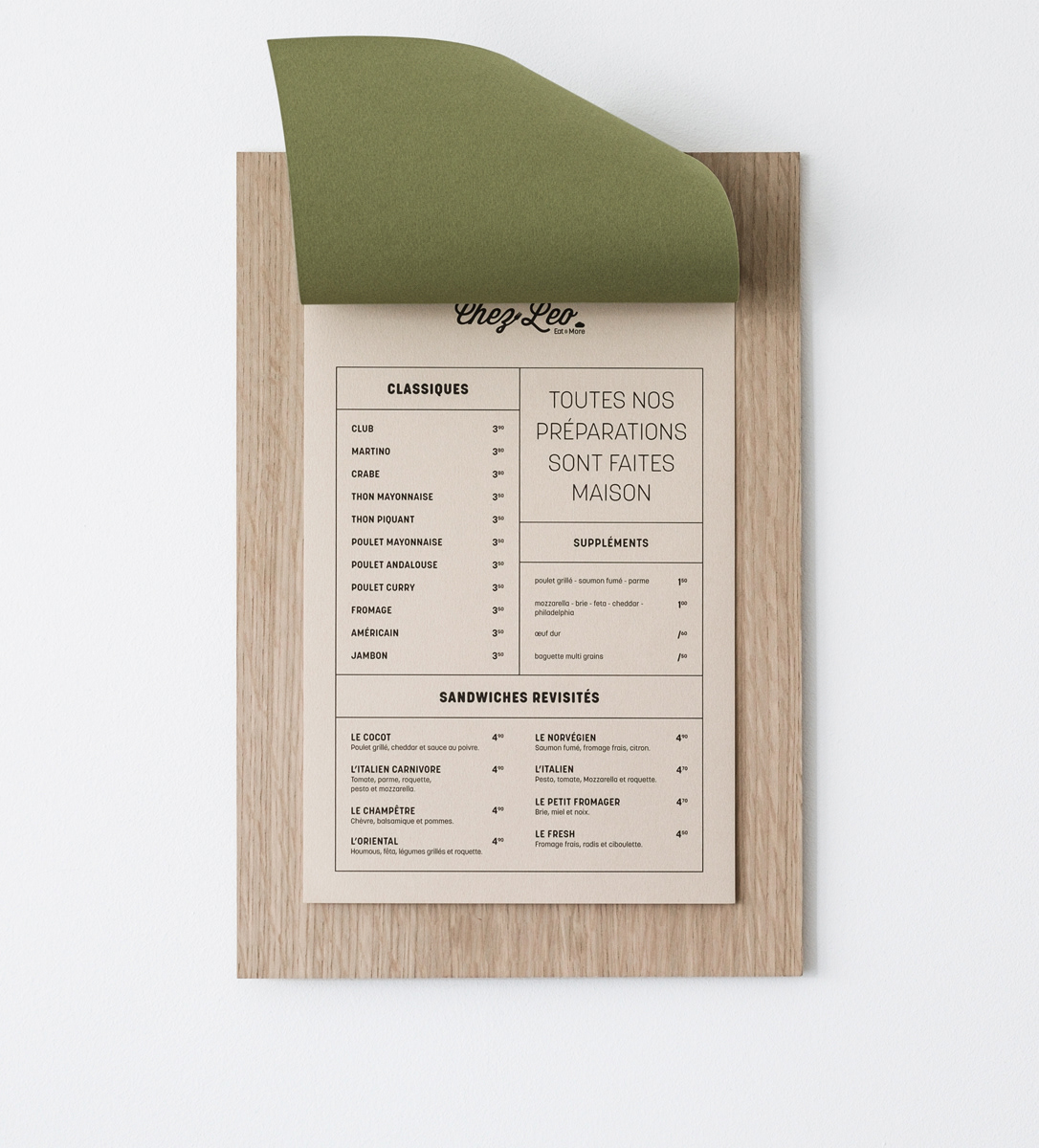
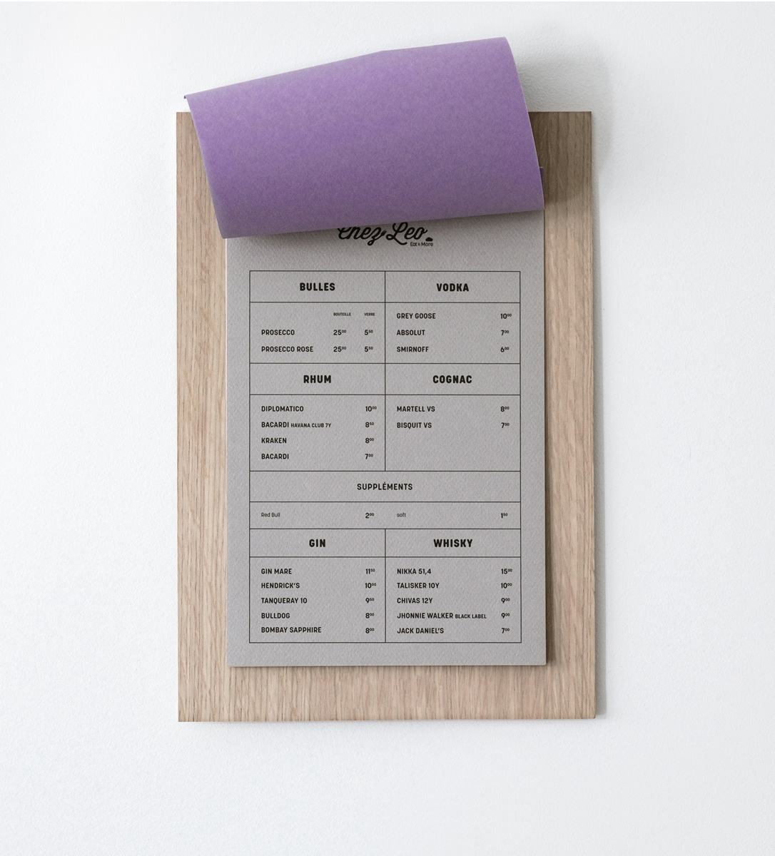
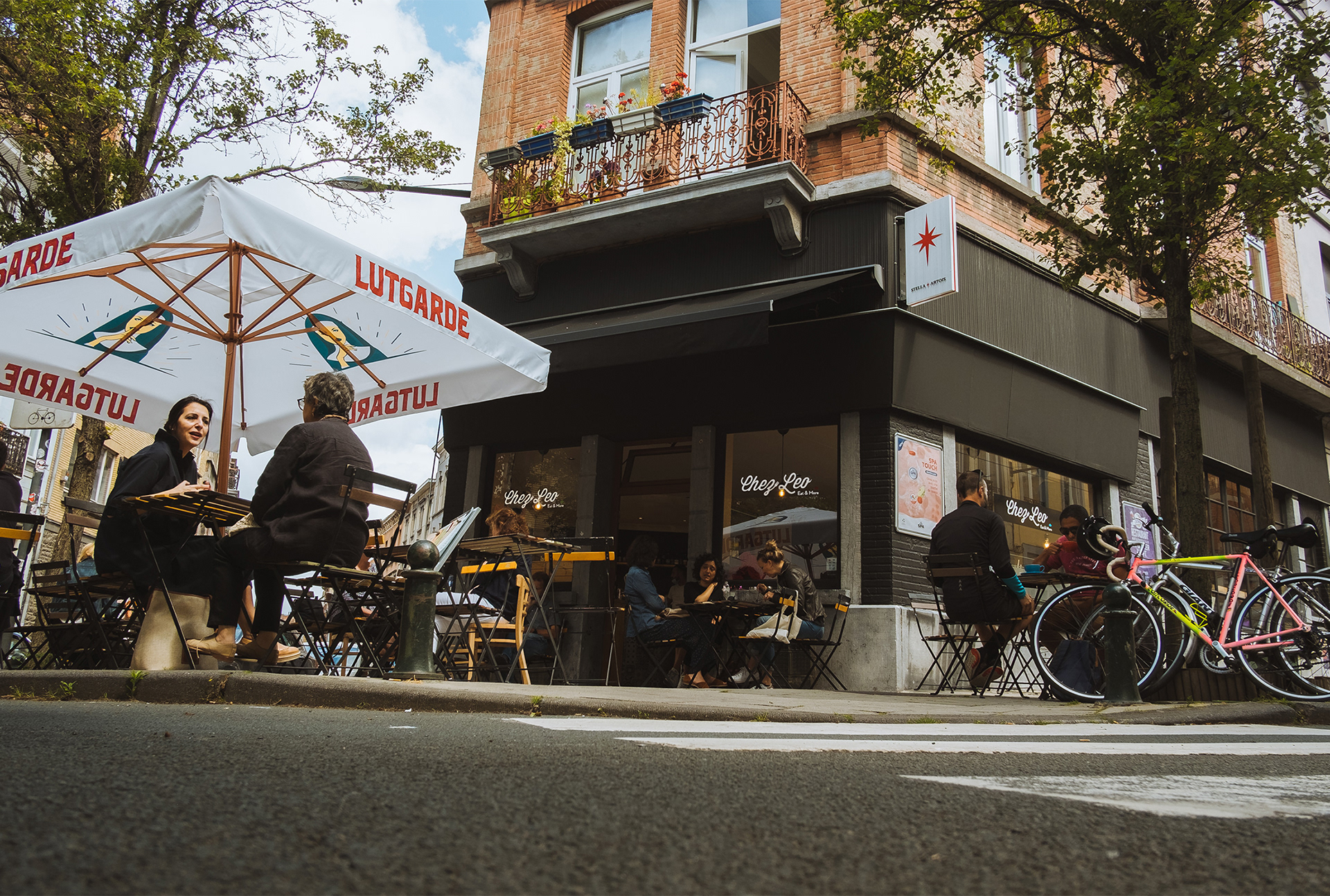
The use of a clipboard menu holder, required by ‘Chez Leo’s’ partners was a key consideration in the project. This constraint was transformed into an opportunity, influencing both the structure and design of the menu to create a harmonious and dynamic composition through precise cutouts and a carefully studied layout.
↓ See my work